Brand assets & imagery
real files · no substitutesLogo & project title
The wordmark always pairs with the project name. Whether the name takes a dot depends on one thing only: is it a domain, or a subdomain of ammo.tools.
 Tools
Tools
AMMO.Tools
Wanda
ammo.tools/wandaRules
Dot for a domain, nothing for a subdomain. AMMO.Tools is the registered domain. Every product hosted underneath it — Wanda, Styles and anything new — is written without a dot.
Rockwell, weight 700. The project name is set in the same display face as headings. Never system sans, never bold-by-simulation.
Capitalise the product name. Wanda, not wanda. AMMO is always uppercase.
One lockup per surface. The wordmark appears once in a header or sidebar. It is not repeated in the page body.
Invert, never redraw. The wordmark inherits currentColor; dark appearance inverts it with filter: var(--logo-filter). No second file, no recolouring.
Clear space is the lockup gap. 12px between the mark and the name, 4px around the lockup. Nothing crowds it.
| Surface | Lockup | Written as |
|---|---|---|
| ammo.tools | Wordmark + .Tools | AMMO.Tools |
| Wanda | Wordmark + Wanda | AMMO Wanda |
| This styleguide | Wordmark + Styles | AMMO Styles |
The styleguide itself follows the subdomain rule: it is served from styles.ammo.tools, so it takes no dot.
Logo


The wordmark is transparent and inherits currentColor, so dark mode inverts it with filter: var(--logo-filter) rather than shipping a second file. Header lockup renders at 64×34px with object-fit: contain.
Icon discipline
Heroicons outline, fill:none, stroke:currentColor, stroke-width:1.5, aria-hidden, rendered at exactly 16×16px inside controls.
Imagery
We use three kinds of picture, and nothing else. Each has a job; mixing them in one place is what makes a set look untidy.
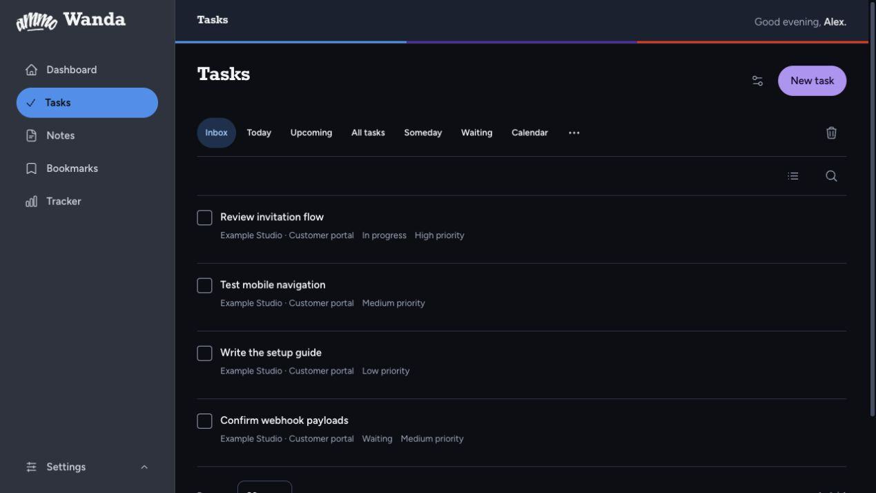
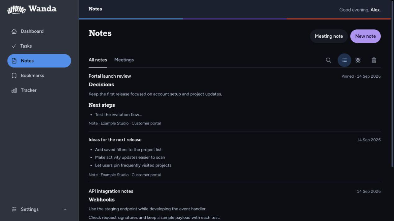
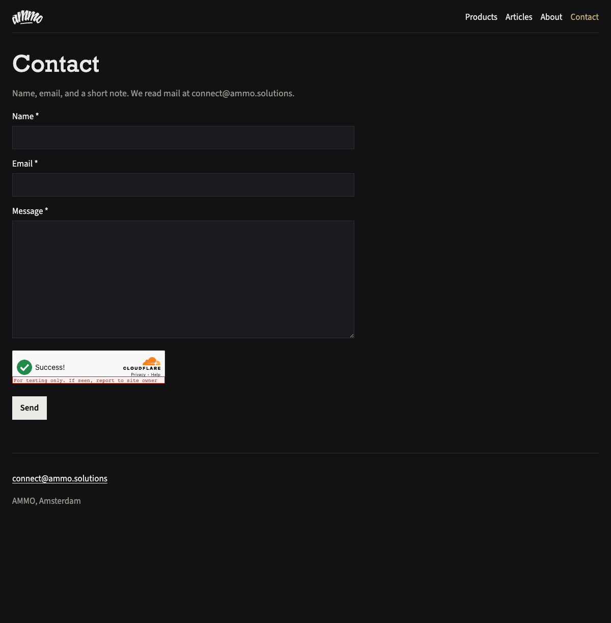
Product — dark UI, uncropped
Real interface chrome at true aspect ratio. Never cropped, never art-directed, never used as decoration.
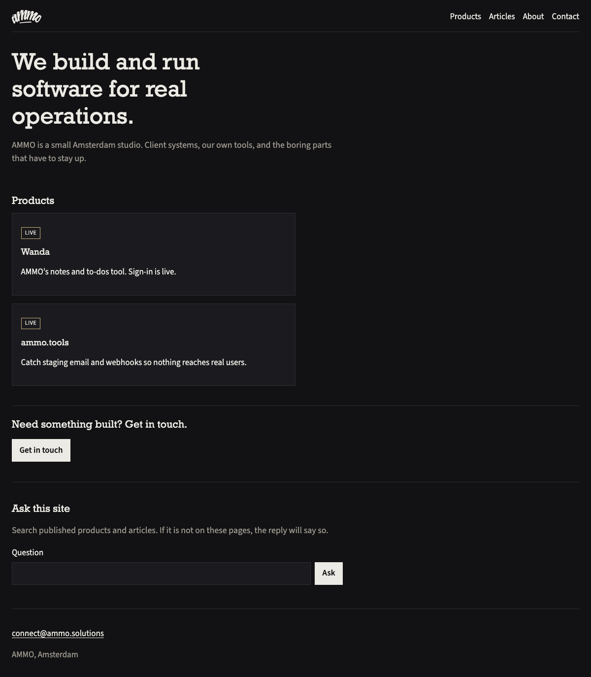
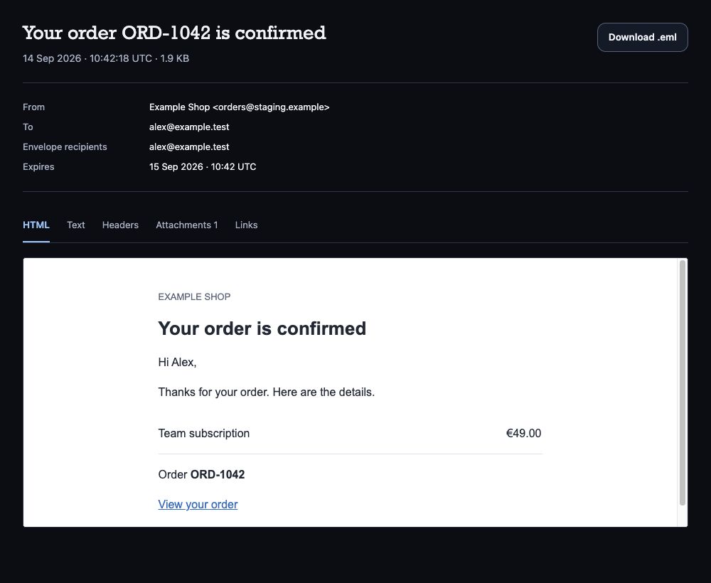
Product — email capture
Captured email, shown full bleed. This one is brighter than the interface, so it never sits beside the dark UI screenshots.
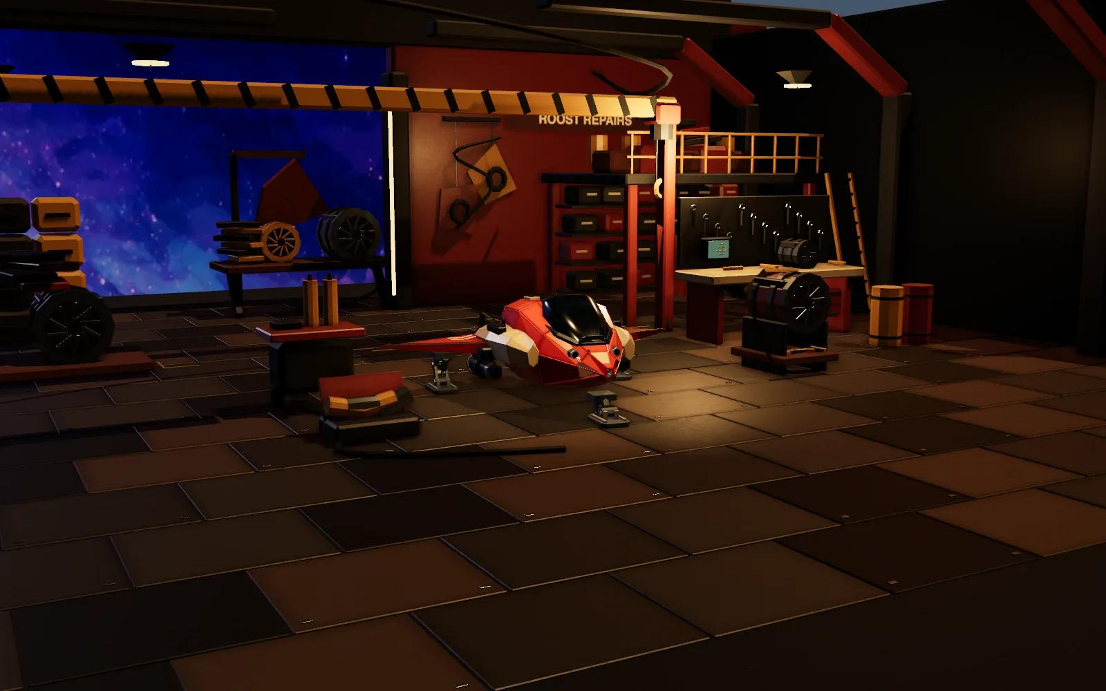
Covers — full-bleed plates
Project covers. Muted, edge-to-edge, and always shown at the same 1600×1000 ratio so a list of projects reads evenly.

Rules
Keep the tonal groups apart. Dark UI screenshots and bright marketing plates have a 7× brightness difference. Shown in one grid they read as a mistake, not a set.
Never crop a screenshot. Show the real interface at its true ratio. Decorative crops hide the chrome that makes it evidence.
Covers are one ratio. 1600×1000, always. A project list only scans if every plate is the same shape.
No substitutes. No stock photography, no hand-drawn illustration, no gradient washes, no multi-colour icon sets.
Avoid: stock photography, hand-drawn illustration, gradient washes on surfaces, screenshots used as decoration, multi-colour icon sets.